Free illustration website official
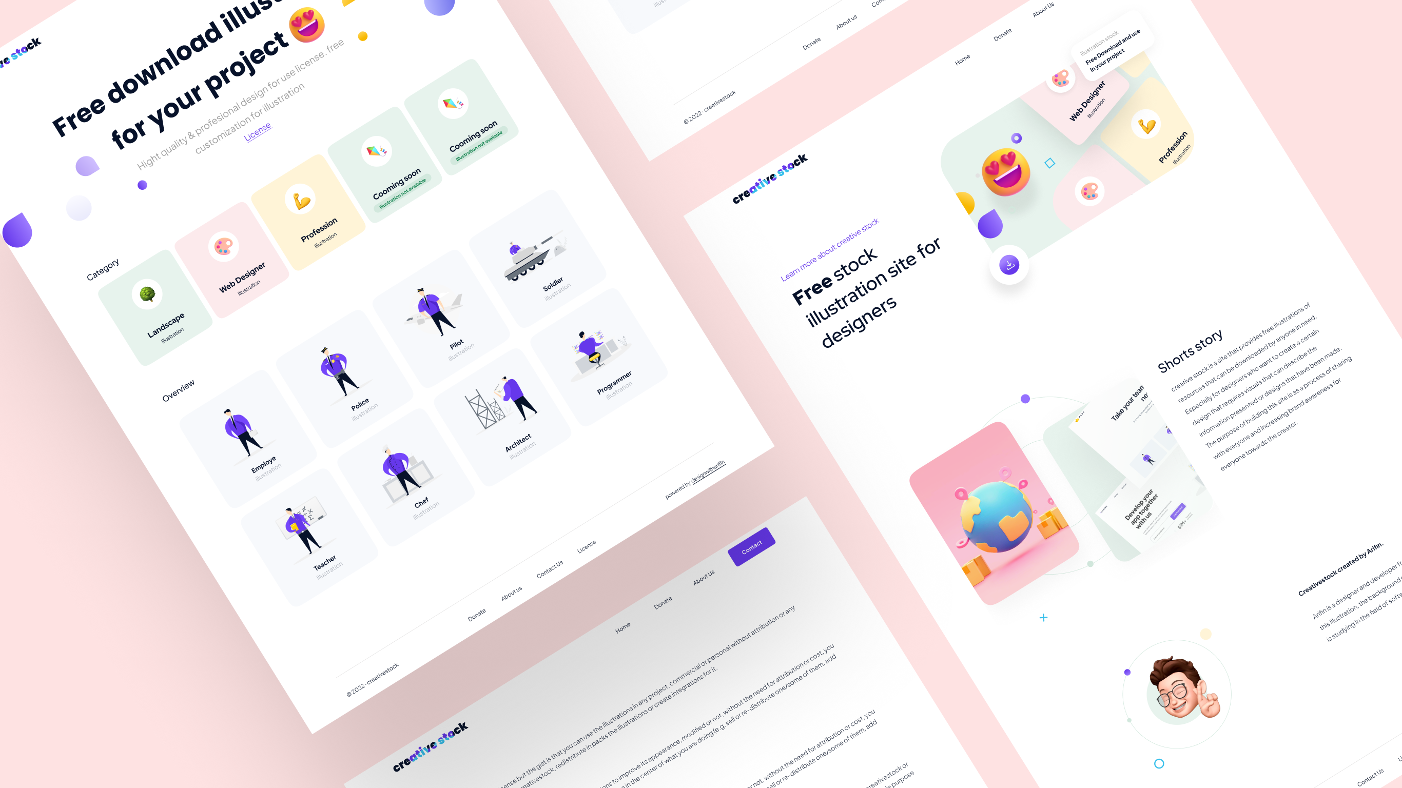
Creative stock is a site that provides free illustration resources that can be downloaded by anyone in need. Especially for designers who want to create a certain design that requires visuals that can describe the information presented or the design that has been made. the purpose of building this site is as a process of wanting to share with everyone and increase brand awareness to everyone.
I built this site using several tools, namely:
- Figma, as a tool for designing website design.
- Javascript, as the programming language that I use on the backend to manage API data and also manipulate the display more reactively.
- Bootstrap version 5, as the css framework that I use for the frontend or appearance of the site.
- JSON, as the end point that I use to display the data.
- Html 5, as the site framework.
These are the goals that the site owner wants to achieve
- Brand awareness. shows that Creativestock is able to compete with other professional illustration provider sites.
- Sharing useful illustration assets for anyone who needs them.
- Bootstrap version 5, as the css framework that I use for the frontend or appearance of the site.
- Demonstrates very professional quality of work produced.
- Get premium free illustration assets.
The main target of this site is designers, app developers who want to find illustration assets that can be used in their projects.

This is the first site built, All views and elements are built from scratch. the following menus are already listed
- Home
- Sharing useful illustration assets for anyone who needs them.
- Details Illustration category
- About Page
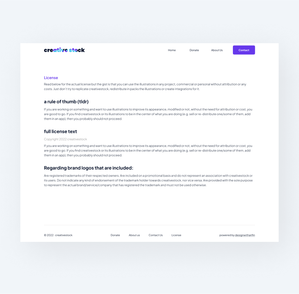
- License Page
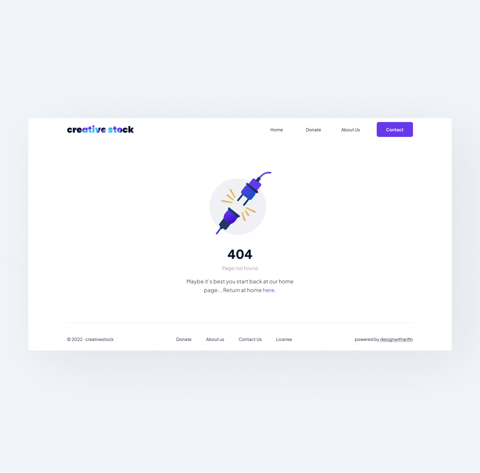
- Page if not present (404)
Collection Requirements
- Determine what information to display (only the important ones).
- Basic color selection for site style by brand.
- Apply a minimalist concept to the display.
- Keywords for design inspiration: illustration, free illustration website, digital assets, art.
This was a source of inspiration for layouts from creativestock competitors that were relevant to the site I wanted to build. And I ended up using some of the layout and design approaches from the inspiration.
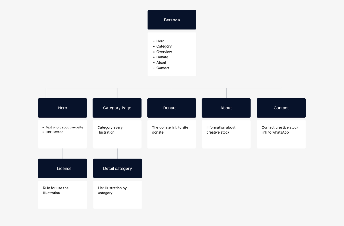
The site map that was built was actually very simple. The site map was made to make it easy to read the entire web structure that was built, especially by myself and even other people to serve as a guide.
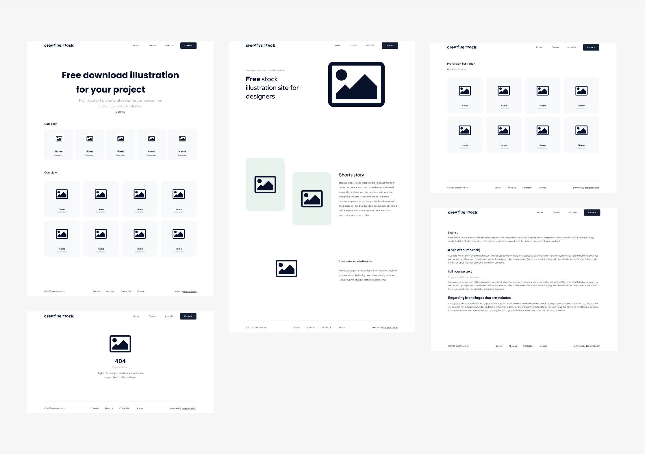
The next step is to create a wireframe for the page.
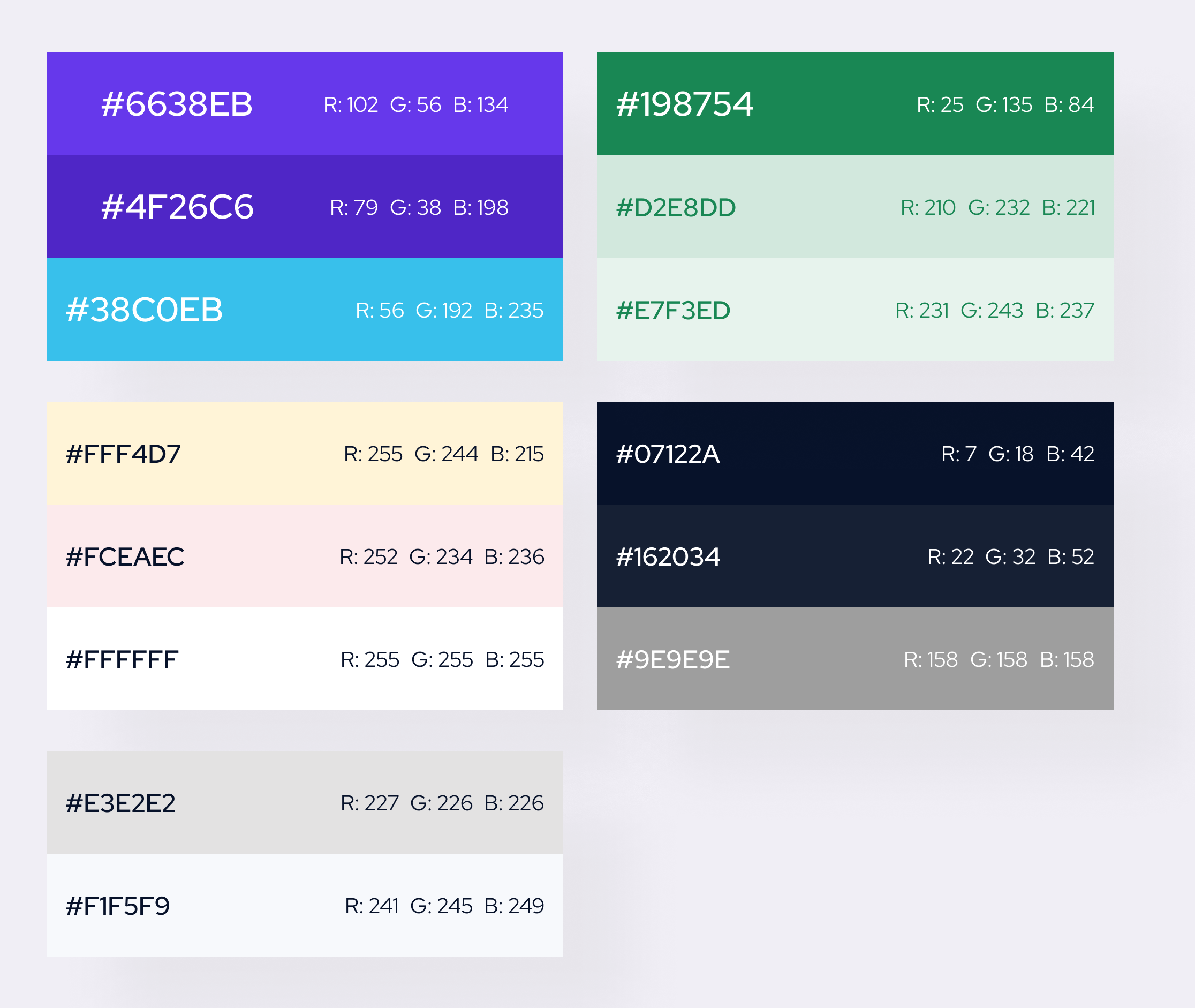
Looking at the purpose of this project, I wanted this site to represent one of the elements of what is displayed, which is an illustration design. Then I had an idea, I imagined various shapes in each part of the illustration design so that it becomes a real shape that is recognized by the eye such as an object or thing. So I decided to research more illustration shapes on the internet and take what parts I could use.
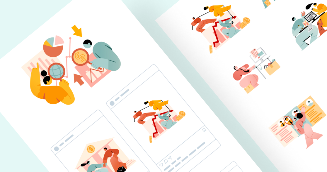
From these images, I got more than enough inspiration that I needed to create the design elements that I would use in the website design.

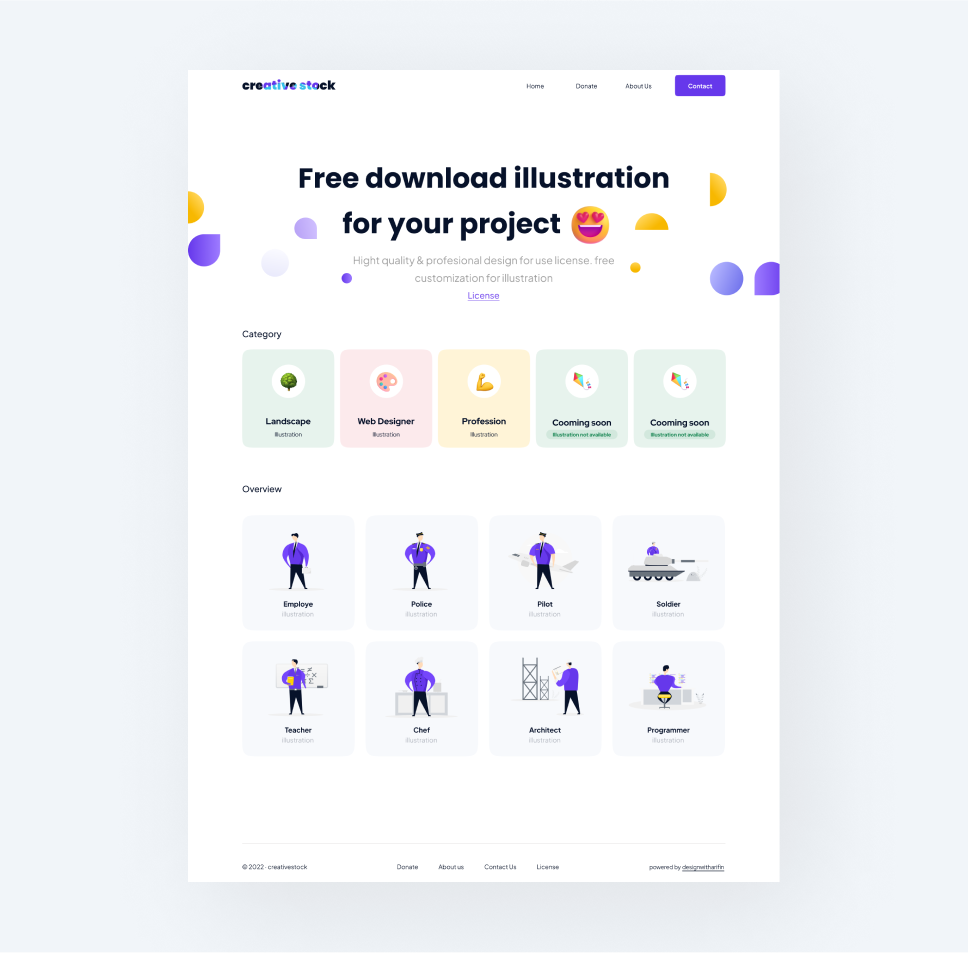
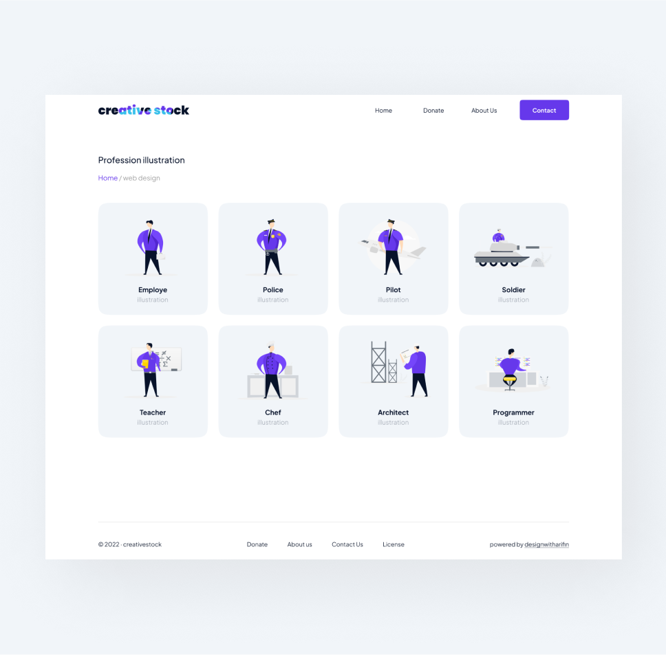
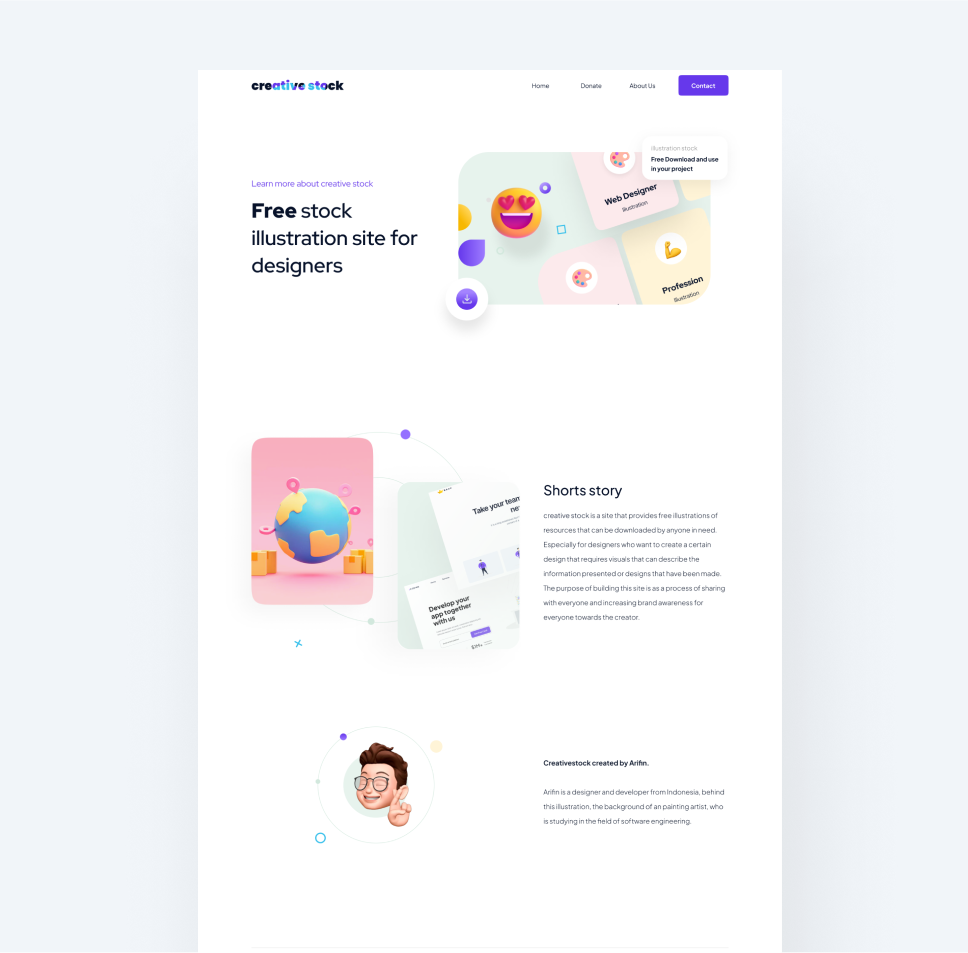
Once I got the design elements and colors from the guidelines, I went straight to the mockup design. And this is the end result
How I Use Design Elements
I use design elements inspired by various shapes in an illustration throughout my designs. And this is how I use them.
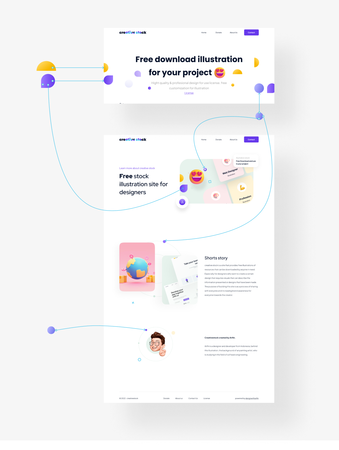
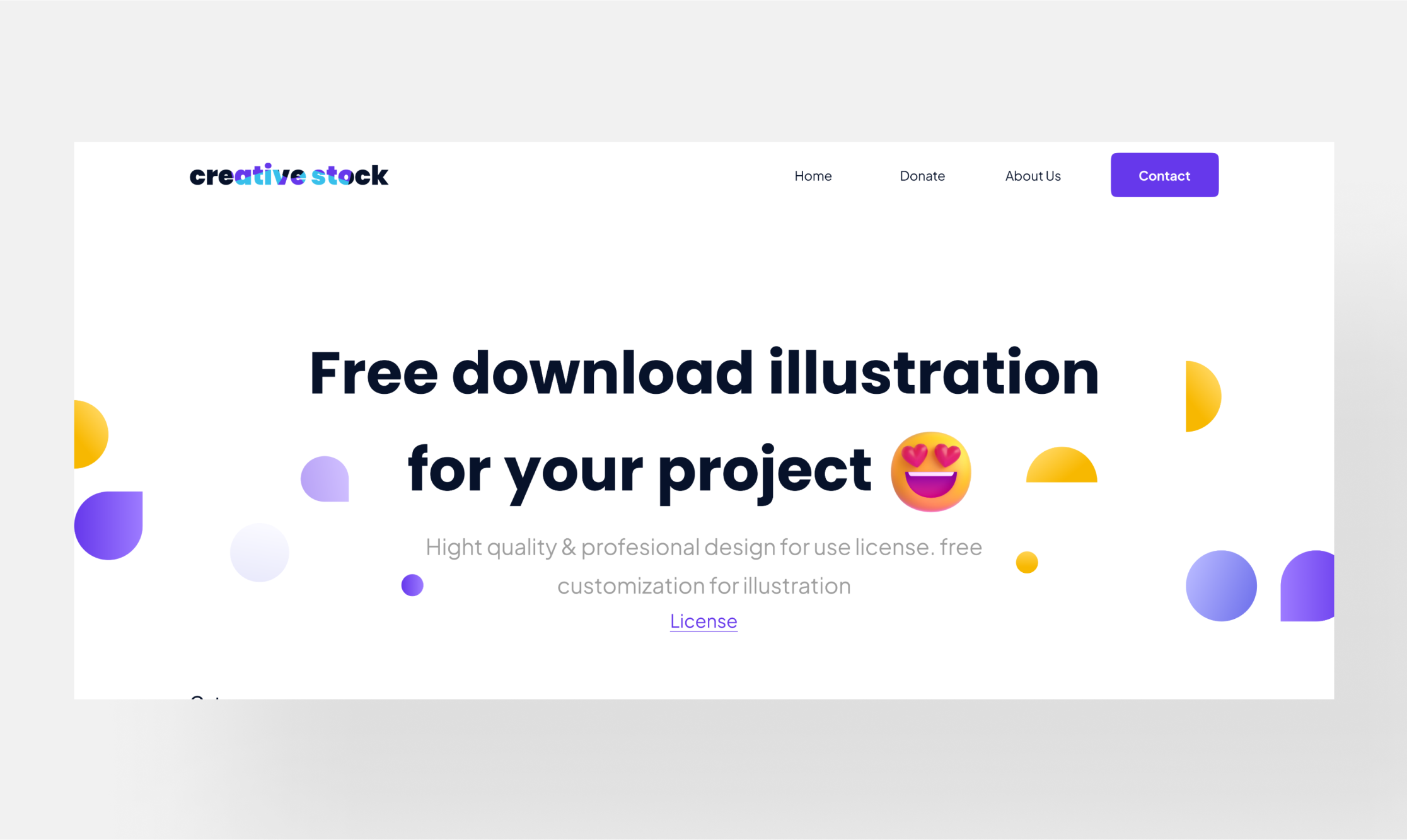
I wanted a really clean and minimalist design, so I only displayed large text as the main element that the user would see and a little background with elements that I had predefined.
After all the designs are complete, then enter the prototyping stage.
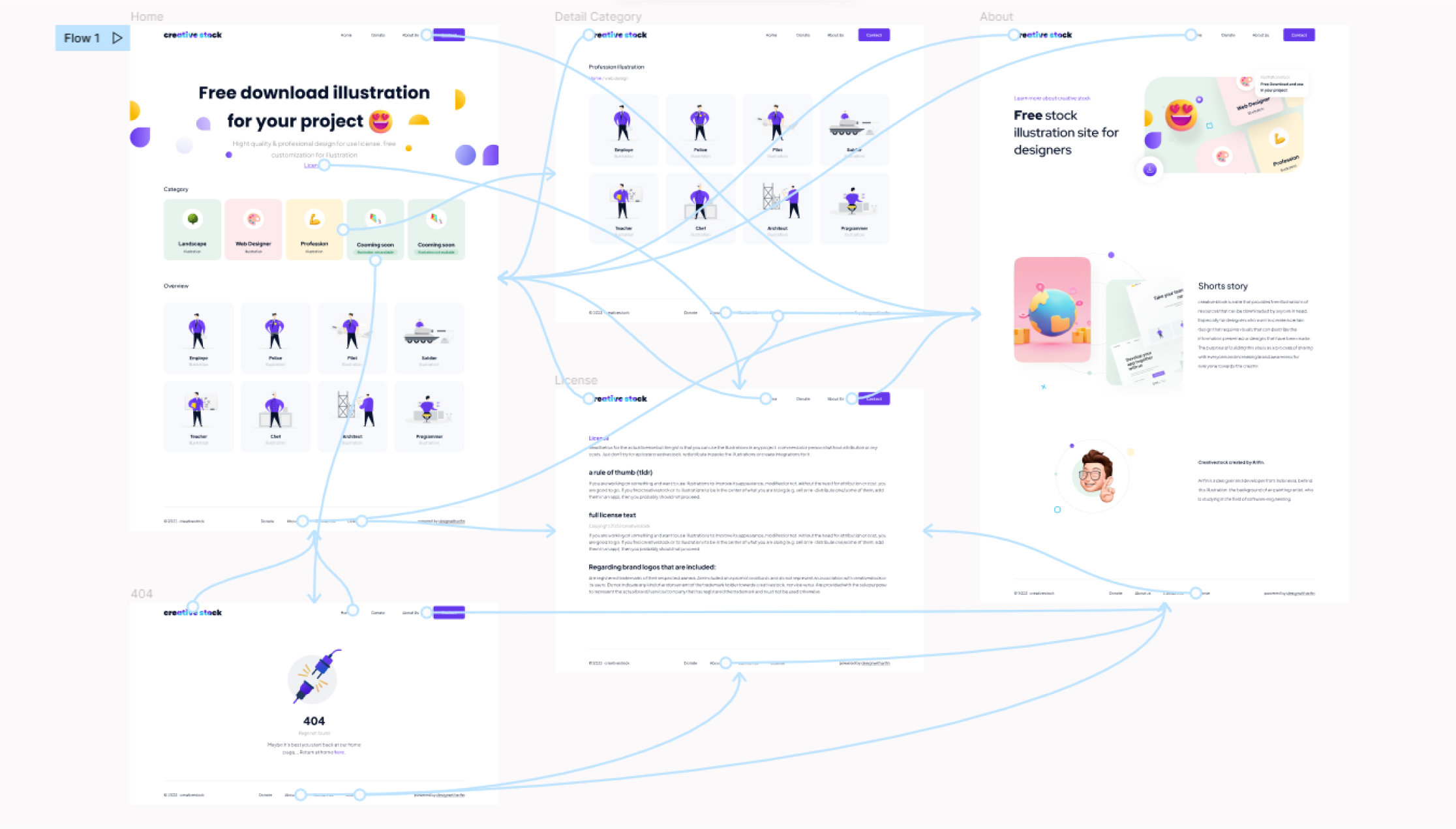
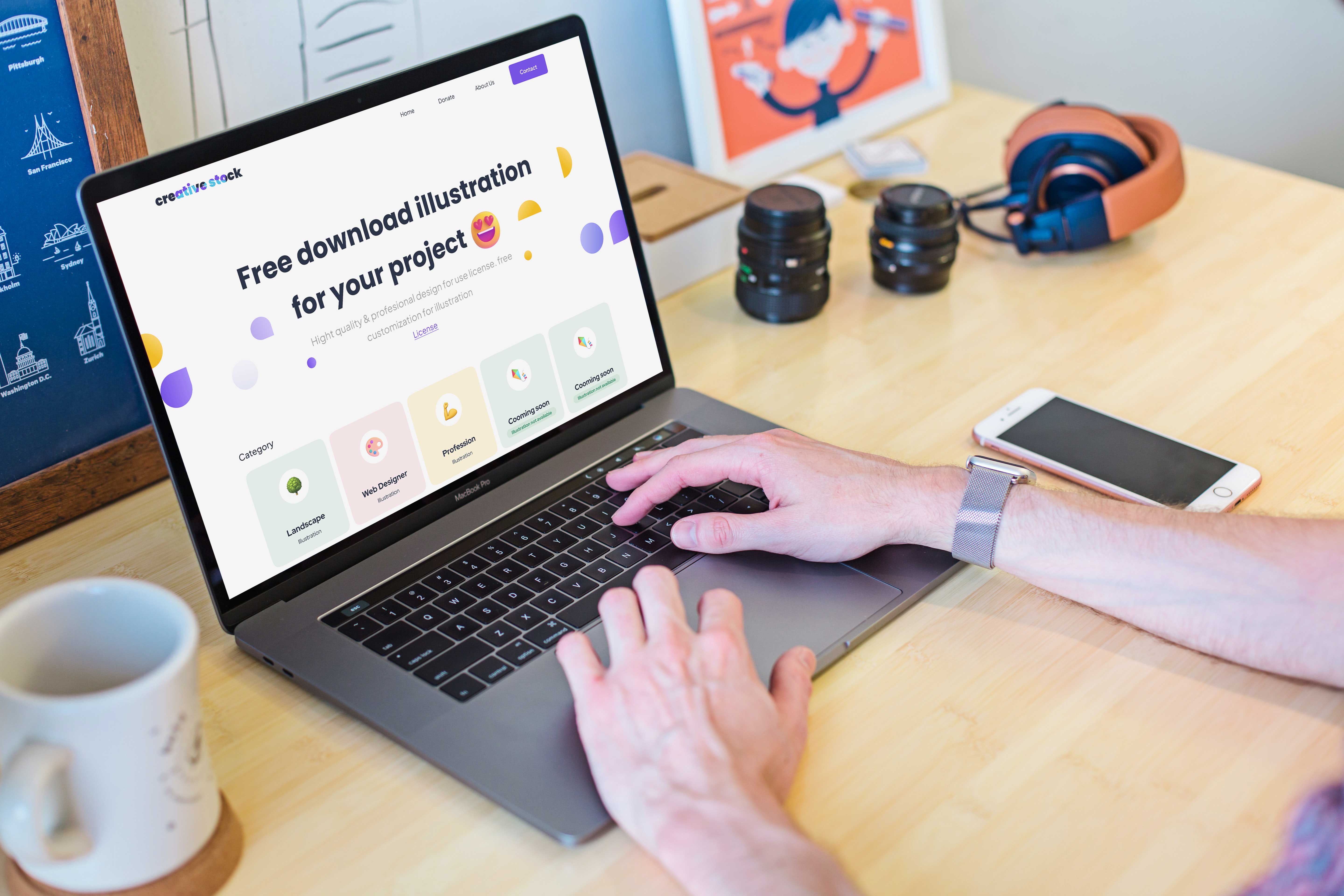
Then after all the prototypes were deemed sufficient, I continued to the development stage by myself.
Launch projectFree illustration website official

Creative stock is a site that provides free illustration resources that can be downloaded by anyone in need. Especially for designers who want to create a certain design that requires visuals that can describe the information presented or the design that has been made. the purpose of building this site is as a process of wanting to share with everyone and increase brand awareness to everyone.
I built this site using several tools, namely:
- Figma, as a tool for designing website design.
- Javascript, as the programming language that I use on the backend to manage API data and also manipulate the display more reactively.
- Bootstrap version 5, as the css framework that I use for the frontend or appearance of the site.
- JSON, as the end point that I use to display the data.
- Html 5, as the site framework.
These are the goals that the site owner wants to achieve
- Brand awareness. shows that Creativestock is able to compete with other professional illustration provider sites.
- Sharing useful illustration assets for anyone who needs them.
- Bootstrap version 5, as the css framework that I use for the frontend or appearance of the site.
- Demonstrates very professional quality of work produced.
- Get premium free illustration assets.
The main target of this site is designers, app developers who want to find illustration assets that can be used in their projects.

This is the first site built, All views and elements are built from scratch. the following menus are already listed
- Home
- Sharing useful illustration assets for anyone who needs them.
- Details Illustration category
- About Page
- License Page
- Page if not present (404)
Collection Requirements
- Determine what information to display (only the important ones).
- Basic color selection for site style by brand.
- Apply a minimalist concept to the display.
- Keywords for design inspiration: illustration, free illustration website, digital assets, art.

his was a source of inspiration for layouts from creativestock competitors that were relevant to the site I wanted to build. And I ended up using some of the layout and design approaches from the inspiration.
The site map that was built was actually very simple. The site map was made to make it easy to read the entire web structure that was built, especially by myself and even other people to serve as a guide.

The next step is to create a wireframe for the page.

Looking at the purpose of this project, I wanted this site to represent one of the elements of what is displayed, which is an illustration design. Then I had an idea, I imagined various shapes in each part of the illustration design so that it becomes a real shape that is recognized by the eye such as an object or thing. So I decided to research more illustration shapes on the internet and take what parts I could use.

From these images, I got more than enough inspiration that I needed to create the design elements that I would use in the website design.

Once I got the design elements and colors from the guidelines, I went straight to the mockup design. And this is the end result


How I Use Design Elements
I use design elements inspired by various shapes in an illustration throughout my designs. And this is how I use them.

I wanted a really clean and minimalist design, so I only displayed large text as the main element that the user would see and a little background with elements that I had predefined.

After all the designs are complete, then enter the prototyping stage.


Then after all the prototypes were deemed sufficient, I continued to the development stage by myself.
Launch project